*1 year of free updates | unlimited domains
Using the plugin will allow you to save time on performing routine operations when building projects.
The plugin complements the interface of the builder and allows you to do your work much faster and more conveniently.
- Insert CSS selectors into two clicks
- Insert image size by the click
- Insert animation delay, image path / timestamp pattern
- Quick copy Section names and Revo Render shortcodes
- New device panel for resizing the preview screen, manually resizing, reversing, and returning to normal values
- Advanced image info
- Autofill image sizes
- Lock / unlock the image cache/rezise
- Preview for the image items
- CodeMirror autosize
- AutoHeight for Select options
- Fix scrollbar issue (Win only)
- Choosen mode for Select lists
- Сompact view of media file previews
- Cope LESS variables
- ASCII only input mode
- Hightlight to non breaking spaces
- Show JSON layout
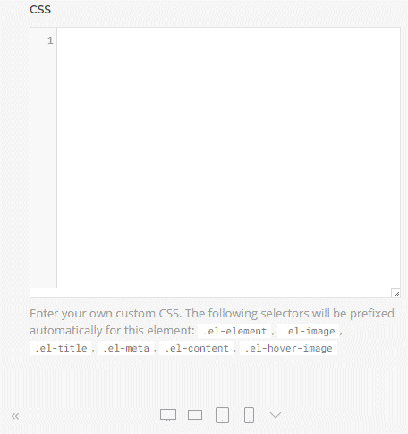
Now you can add a selector to the CSS field in two clicks, and when using the new media panel, you can quickly form Media queries also.
Easily insert an animation delay
Click order: 200 - 250 - 300 - 350 - 400 - null
Easily insert an extended Path pattern
Use the left button click on the Section name to copy this name to the clipboard.
Use the right button to click on the layouts/elements library entries name to copy Revo Render shortcode to the clipboard.
Now you can test the layouts directly in the builder.
Select the device or set the screen size manually.
Now you don't need a separate screen to test the layout.
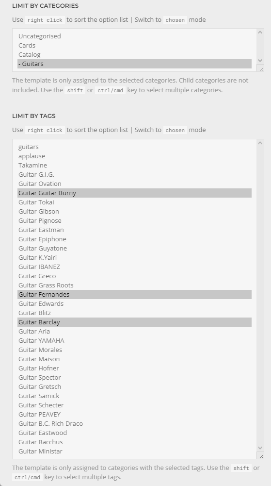
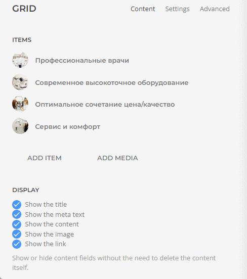
Now the list of options in the template settings in the builder automatically adjusts to the size of the list. This makes it easier to manage options.
If you need more order, you can use a right-click on the list or click the hint above the list to sort the values alphabetically.
If you need to search among the values, you can use the Chosen mode to control the options.
Show information about the actual size of the image, proportions and file size.
*file size Win only option
Show information about the actual size of the image, proportions and file size. Use the click to update the dimensions.
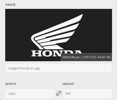
Lock / Unlock the image cache/resize by one click
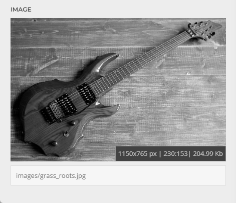
Image download with one click
Quick preview to the image items
Now the size of the editor always follows the height of the content.
More information on the screen and less time to search.
Look at the Hero title on the mobile phone screen.
The scroll bar in the preview occupies part of the screen, which leads to an incorrect estimate of the size of the layout element.
Note that this option does not show a reliable picture when using CSS Media selectors and is intended only for the initial evaluation of the layout.
If you are so cool that you use theme LESS variables in your layout, then you should appreciate this option.
You need to activate it directly when you open the desired section of the style, the plugin accelerates the appearance of a hint with the name of the LESS variable and intercepts its value on click. You can collect a list of the necessary variables in the browser console as in notepad, the last value will also be available in the clipboard.
When using the Cyrillic alphabet or hieroglyphs in the input fields of custom rules, the Page Builder often loses the cursor position and you spend time searching for the position, deleting the incorrect text, and then typing the rule again in the Latin layout, now this problem will not be. A special option blocks the input of non-ASCII characters and insures you from this error.
Just click to Star icon for highlight nonbreaking spaces in the layout, which can lead to a violation design of the layout.
*This option is intended only for diagnostics. When the option is activated, the code is updated in the viewport, which may cause a short-term violation of parts of the layout when drawing the page, but this does not affect the layout itself in any way. The page will return to its previous appearance whenever the layout is changed in the builder or the page is updated.
In my piggy bank there are a few more ideas that will be studied and, if possible, implemented in new versions.
Here are some of them:
If you have any new ideas and suggestions, please contact me.
Image preview for Yootheme media manager (list mode)
Compact style into the Yootheme media manager
Fix Grid image preview in the list
Fix choosen mode script launch
Auto height for Builder Select options
Sort the list of Select options alphabetically
Chosen mode for Builder Select options
Image download action
Trim the section name when copying by click
Fixed copy to clipboard actions for unsecure HTTP connection
Added notifications when copying values
Added iPhone 13 family to the device list panel
Advanced debug console:
- show JSON to the current article/template
- calculation of the current layout size in the database field
- show Max Input Vars / Post Max Size values
Joomla 4 support
Added nonbreaking spaces hightlight feature
Added copying of the shortcode from the element library for the Revo Render plugin
Added notifications when copying values
Fix loading of the device list on several server configs.
Added copying of the section name by click
Added copying of the shortcode from the layout library for the Revo Render plugin
Fix loading plugin with site installation on subfolder
The plugin script is now loaded only in the theme customizer.
Refactoring of the plugin package
Changed device list order
Changed scroll size calculation
Added update server (notify only)
Added new device profiles (last iPhone models)
Added getting image details after upload and select a new image by first click